So, we have come to the end of the coursework. Its been long and hard at times, but overall it has been a great experience. I have learnt a lot throughout this course and have really enjoyed myself. Now I can formally sign off to conclude this coursework. So.. byeee! :)

Showing posts with label Eda Yuzudik. Show all posts
Showing posts with label Eda Yuzudik. Show all posts
Saturday, 28 January 2012
Tuesday, 24 January 2012
EVALUATION: Question 4 - What have you learned from your audience feedback?
This feedback is from Elis, who thinks our video was "really good", the only criticism she could think of was regarding the colour. This was a problem we had while we were editing; we were worried that the colour would come out different and not be the way we wanted it to be. However, although it wasn't the way we viewed it on the Mac's, it was still good and many other people commented on how the colour was really effective and unique as no-one else had it.
This feedback is from Fatima who really liked the overall story throughout our music video, where our male actor was with our artist at the beginning then leaves and then comes back again. She also thinks that our artist looked innocent which was how we aimed to portray our artist; similar to Ellie Goulding. However she thinks that our artist could have improved on the lip syncing, saying it "could have been a bit more tight" and "she could have pronounced the words a bit better"
Many people commented on the idea of the frames hanging from the tree and the idea of holding photos in front of the camera then moving it away to reveal the actual place that the photograph was taken. But most people enjoyed the way we added a pink/purple colour tint to the video; saying how it is "unique" and "really nice".

When our video was screened at the cinema I remember the reactions of the audience; there were many "ooo's" and "aww's", suggesting the romanticism of the story. The video was followed by a loud applause throughout the cinema.
Looking through all of the feedback we received, the suggested improvements included:
- Better acting from our artist and less shyness
- Improving the lip syncing
- Improving the story and making it more easier to understand
- The colour difference between the way the video looks on the Mac and on the cinema screen
In light of these suggestions I would put more thought into the way the colour would appear on a larger screen and would have rehearsals in order to improve the performance of our artist.
EVALUATION: Question 3 - How did you use media technologies in the construction and research, planning and evaluation stages?
Throughout this year I used a wide range of technologies to help produce a music video and ancillary products of a high quality.


Here is the link to my animatic..
http://candipop11group30.blogspot.com/2011/10/planning-animatic.html
Here is an iShowU screen recording to show me using the 'Colour Correction' tool on Final Cut Pro to adjust the colour of the clips..
Friday, 20 January 2012
EVALUATION: Question 2 - How effective is the combination of your main products (video) and ancillary texts (digipak and advertisement)?

There are many links between our music video and my ancillary products. I think it was important that we did this, mainly because we are introducing our artist for the first time so if people see the video it can lead them to finding and buying the digipak. The same fonts are used on my advertisement and digipak as a form of linking the two. My ancillary products have a clear house style. The aim is to promote my artist and her image in order to persuade the audience to buy into the artist; the video and ancillary product does this.
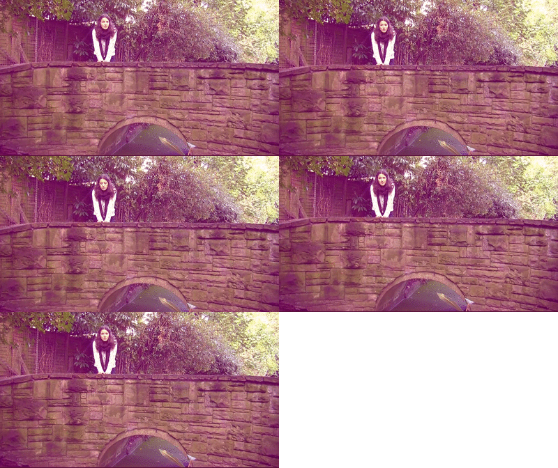
Another reason why my ancillary products and video have a link is because they were both taken in the same location. The screenshot below shows the artist is a field with long grass behind her; this is the exact location where I took my photos for my ancillary products..

 |
| Screenshot from our video. |

 |
| Rural location (verse) |
 |
| Urban location (chorus) |
Friday, 13 January 2012
EVALUATION: Question 1 - In what ways does your media product use, develop or challenge forms and conventions of real media?
We looked at quite a few different artists and their videos in order to get some ideas that we could incorporate into our music video, but our main influence was Ellie Goulding. Her brand image is the type of image we have created for our artist (Mia Knight) and therefore we felt like it would be a good idea to use some of the conventions used in Ellie Goulding's videos. The two Ellie Goulding videos that we were most influenced by was 'Your Song' and 'The Writer'. The locations of these videos are very green and rural so we used this in our music video too; except for the choruses, where the locations were more urban.
Similarities between our video and Ellie Gouldings' 'The Writer' and 'Your Song' videos..


Andrew Goodwin's theory discusses how artists directly address the audience by looking at the camera (breaking the 4th wall), this is one of the main conventions used in our music video. Addressing the camera is very important I think, as it involves the audience and makes them connect with the artist in a way; making it more likely for them to purchase the digipak, hence making the video a success in terms of profitability. Another important convention of our music video is lip syncing; which is used in every music video (obviously). Other important conventions that I followed include, editing to the beat and having a clear verse/chorus structure (as she is in urban areas for the choruses and in rural areas for the verses).
Carol Vernallis' points of observation apply to our music video in the sense that we do not have continuity editing, we usually have jump cuts and the camera moves in time with the music. However an observation that does not apply to our music video is the point about there being really obvious edits to draw attention to themselves, such as wipes; we wanted to follow the conventions of the genre which negates the idea of having obvious edits.
Aside from the mise en scene, another thing that influenced us from her videos was the camerawork; there is a very wide variety of camera shots/angles ranging from high to low angles and close to long shots..
The colour effect we used was acquired from Rihanna's 'Only Girl In The World Video. We liked this colour idea because pink is a colour that suggests innocence and is basically how we aimed to portray our artists brand image. Our colour is more pink/purple as we liked the vintage-like effect it created.

Rihanna's 'Only Girl In The World'.

Here is a Prezi I made discussing conventions of my ancillary products..
Wednesday, 11 January 2012

Monday, 9 January 2012
First Day Of Editing My Advertisement
I started and finished my advertisement today.. Unlike my digipak which took 3 days of editing. I think that doing the digipak first enabled me to finish my advertisement quickly as I knew what fonts and colours to use.
I added a Lighting Effect to make the picture blend/fade into the black background..


Using iShowU to show me using 'Adobe photoshop Elements' to edit my advertisement. In this video I am adding a Lighting Effect to make the bottom of the image blend into the black background..
I then started to add the text (which I simply dragged from the digipak onto the advertisement)


Third Day Of Editing My Digipak
Today I finished my digipak!
I was playing around with the colour of my digipak and could not decide which one to use!


Friday, 6 January 2012
Second Day Of Editing My Digipak
Almost finished my digipak! I used both 'Quark' and 'Adobe Photoshop Elements'. Just a few more finishing touches I need to make..


Using 'iShowU' to show me editing my digipak on 'Quark' and 'Adobe Photoshop Elements', and also taking screengrabs using 'Voila' and using 'Fontcase'..
Using 'Fontcase'.
Adding the copyright information to my digipak on 'Quark'.
Adding the barcode to my digipak on 'Quark', then taking a
screengrab of it using 'Voila', and then putting the screengrab
onto 'Adobe Photoshop Elements'.
Adding the record label logo on my digipak on 'Adobe Photoshop Elements'.
Wednesday, 4 January 2012
First Day Of Editing My Digipak
The first day of editing my digipak was not so good at first as I saw that some of the photos I had taken were out of focus. It got better though when I narrowed down my selection of possible digipak photos and started to edit. I added different effects and played around with the brightness of contrast; making sure I didn't go over the top.
The first photo I chose to use came out pixelated when I put it onto the digipak template due to the fact that I made the photo bigger to fill the front cover..


As a result of this, I had to use another photo..


I used the Magnetic Lasso Tool to cut Alia out so I can make the background abit blurry in order to make her stand out more..


Photos That I Might Use For My Digipak
I chose these photos for my shortlist as I believe they fit well with the image that I am aiming to portray for the artist...


Wednesday, 14 December 2011
Final Mock-Up For My Digipak & Advertisement
This my final mock-up draft for my digipak and advertisement. I have added the things that were missing.


Subscribe to:
Posts (Atom)