May aswell make a 100th blog :p
Anyways this has been a long but very exceptional experience.
GOODBYE BLOGGER!

Showing posts with label Dipika Ahmed Nessa. Show all posts
Showing posts with label Dipika Ahmed Nessa. Show all posts
Sunday, 29 January 2012
Formal sign off.
Saturday, 28 January 2012
Wednesday, 25 January 2012
EVALUATION: QUESTION 4 - What have you learned from your audience feedback?

When I arrived at the cinema I was really excited as well as anxious. I couldn't wait to see everyone else's music videos, and see the reaction of ours. Everyones videos were absolutely amazing, everyone did a great job. Firstly, one of the things I was worried about was the colour correction. Mary and Louisa had told us it may not look as good on the big screen however it turned out amazing and most of our positive feedback was regarding this aspect of our video. I was immensely pleased with my group and I, and I bet Mary and Louisa were happy too! We received such amazing feedback, everyone had nothing but good things to say about our music video with only little negative feedback. The feedback has helped to understand a variety of things. Not only have i learnt what I could improve on, but what the viewers/target audience expect and want.
Analysing feedback comments..
'The film was really good, i liked the different effects that they used. The colour correction, they made it look like a indie music video, it really represents the genre. That was one of the many good things however one of the very FEW negative things, was the some of the performance. The actress was a bit shy, throughout the rest of it, it was fine. Really good'.
From this i have learnt that our decision to use colour corrector has paid off, he seemed to really enjoy it. He said that it looks like a music video from the Indie genre, he was spot on! He clearly knew the type of genre we aimed to represent. This has shown me that our efforts were successful inorder to meet the genre conventions and portray it sufficiently. I was extremely pleased with this all the hard work was worth it. The only negative thing he had, was regarding the actresses performance, he said she looked shy in few parts of the music video. So, now i know that the performance is just as vital as every other aspect of the music video such as camera work, editing and costumes ect as this is what pleases the viewers. So next time what I would improve on is the performance.
'Ok first of all, claps. Beautiful video. My highlights of the video were the picture thing and then it actually being there. The colour correction you put on there was beautiful, the red tint was amazing. The storyline at the end when the girl leaned her head on the guys shoulder. It was like poetry, fantastic video. Only criticism is that it should have lasted longer'
This comment made me 'awwwwww' we received such lovely feedback. I have learned that, the colour correction was a success, Jerome thought it was 'amazing'. He also, made a comment on the storyline, which we also received positive feedback from others. He really enjoyed that 'romance element' as did most people. From this I have learnt that if you work hard, it really pays off. Since he did not have any criticisms, I really would not know what to improve on from his point of view. Next time, I would maybe improve the performance for a better quality of a music video.
Target Audience..
'I loved especially the pink tint you added to it, I thought that made it really unique (because no one else did that). I loved the costume changes, it looked really professional. I think it was just amazing, no improvements.'
As much as the boys enjoyed our music video, primarily our target audience was young teenage girls, into music and romance. Valeza, fit perfectly into our target audience. Looking at her feedback, she LOVED the video. This shows me, that we appealed to our target audience effectively.
Overall the main positive feedback we received were based on the following aspects:
- Colour correction - Everyone enjoyed the pink/red tint. Some said it represented the indie genre others said it brought them back their childhood.
- Picture of a location, then the actual thing being there - Everyone said was really cool and effective. They seemed to really enjoy it.
- Storyline - Everyone enjoyed the element of romance. And how each clip linked with the other, there was a subtext behind it.
- The various locations.
- All the differect costumes.
- THE CUTE ACTOR!
WHAT I WOULD DO NEXT TIME..
However we did receive negative feedback, although it was really not much. People have said the song could have been mimed better and the actress should have been less shy. So from all the feedback we have received, next time I will improve on the lip synching of the words and improve the performance for a better music video. I will definitely keep in mind the criticisms.
Through Vimeo we were able to see how many people viewed our video. We received 42 views, not as many as the other videos, but not as little as some. I would say I am please we did get 42 as we could not expect that many, as it was password protected, so not everyone was able to access it. However, if it was on YouTube it would be publicly available for everyone. So next time I think I would market it properly, upload onto my youtube account and see the reaction on there.


Lastly teachers comments - was the icing on the cake for me really. The were really proud of us and immensely enjoyed watching our music video. Getting such amazing feedback from Mary, Rebecca, Louisa really meant a lot, not to mention they are marking our work so this may lead to a really good grade - POSSIBLY :p
“Right, your video. I think it’s lovely. And I’ll tell you why...It brings me back to my childhood (actually I was born in the 70’s; I think I should point that out). I think the filter looks amazing, it gives it such a professional feel and your performance in it is really excellent [the way you portray Ellie Goulding). I think (Portobello) fits in so well with the filter, the bright colours from the doors and stalls, it all fits together perfectly”
Rebecca Morris, Media Teacher
Mary Berrisford, Media Teacher
Digipak Feedback..
' I think it works really well with the video. I can clearly see the visual link between the 3 of the products as you have carried out the pink tint which I thought was really pretty and unique. I also liked the fact that you stuck to the conventions of ancillary products. And I really like the fact the artist had the same style of clothes and make up in the video and the digipak and advertisement. The font really goes well with the style however the picture could have been more clear.'
Salma Begum, Candi student
From this I have learnt that the colour a scheme was appropriate and extremely helped in linking all my media products.Also that my choice of fonts went well with the artist therefore I should also ways do efficient research of my genre. In addition to this, maintaining the same style of the artist from the music video to the ancillary products was indeed a good idea as the artist is not mainstream so it wouldn't be appropriate if she stepped out of the genre and challenged the genre conventions just by portraying her image in a different way. Therefore I have learnt that I should always go for the safe option in order to create successful media products. Lastly, I received negative feedback on the photo quality; it could have been clearer. For me, this was my major drawback whilst creating my digipak and advertisement so I saw this coming. So next time I would definitely make sure I take my pictures in the right focus.
EVALUATION: QUESTION 3 - How did you use media technologies in the construction and research, planning and evaluation stages?

For planning and research we mainly used the internet. Ultimately, I used Google to search images, perfect to look for different artists' album covers for inspiration in the process of producing a promotional package for our artist 'Mia Knight'. YouTube was vital for researching music videos, this was extremely practical as I spent a lot of time seeking ideas and inspiration from these for our own one. Blogger extremely crucial, as we used it a lot to record all our planning, researching and evaluation for our music video and ancillary products. Ellie Gouldings website, helped immensely as from this we were able to fully capture Ellie Gouldings image and the genre and then incorporate it into our video. This was widely used for inspirational purposes. Lastly Vimeo was really useful to view and reflect on our video also check out the views and feedback.
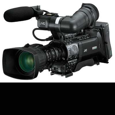
For the production process we were fortunate enough to use state of the art equipment, such as JVC camera, Flip camera, Digital camera and Memory cards provided by our college. For the entire filming process, we used the JVC camera, JVC camera was very versatile and easy to use once you got the hang of, not to mention the quality was simply amazing! The main functions of the JVC camera we used were the auto zoom for different shot types ranging from close ups to long shots and birds eye views.
Whilst one of the group members where filming, a different person would capture the moments by using a Digital camera, which was very useful as were able to blog about our experiences and show our moments. We were also provided with a Flip camera, this was used to record audience feedback for our music video, recordings of each of us explaining an aspect of our video and used to film some of the editing process. Lastly we used Judith's DSLR camera to take the photos for our digipak, this was a pleasure to use as the quality of the photos were incredible.
Just a scrapbook of the photos taken during our filming session in PorteBello Road.
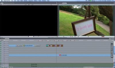
For the editing process of our music video and ancillary we were always on the MAC'S using various programs and software. To edit our music video we used Final Cut Pro, a very unique tool to create a music video exactly the way you want it. We were able to shorten clips, adjust the lighting and also tint the colour; which we did. We downloaded our song through Flyvto and put it into Final cut pro, ready to use. A new software which I have come across since the AS year. For my ancillary products, I used Photoshop to create the entire Digipak all four panels, where I was able to do almost anything to my photos to make it look the way I desired. I mostly used the crop tool, adjusted the lighting and some of the filters, like the glow and photo filter to adjust the colour. There was one drawback though, I did not really like the Photo filter on Photoshop as I felt I could not get the right colour, so before uploading on to Photoshop I used Picasa to edit my photo. I simply adjusted the lighting and added a pink tint. Lastly as there is not a variety of fonts on Photoshop, I was able to find ones that I liked on Font-case and then activated through Photoshop whereby I was able to use it.
One of the techniques we used for our video was the reverse function tool on final cut pro. The Video below is a Screen Casting of Eda and I trying to do the reverse clip we had come up with. This clip reflects Instead of Alia breathing out, we wanted to reverse it so that she breathes in. This also goes perfectly well with the lyric 'I'll hold my breath'. It was terrific timing!
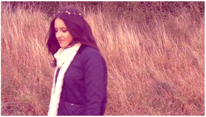
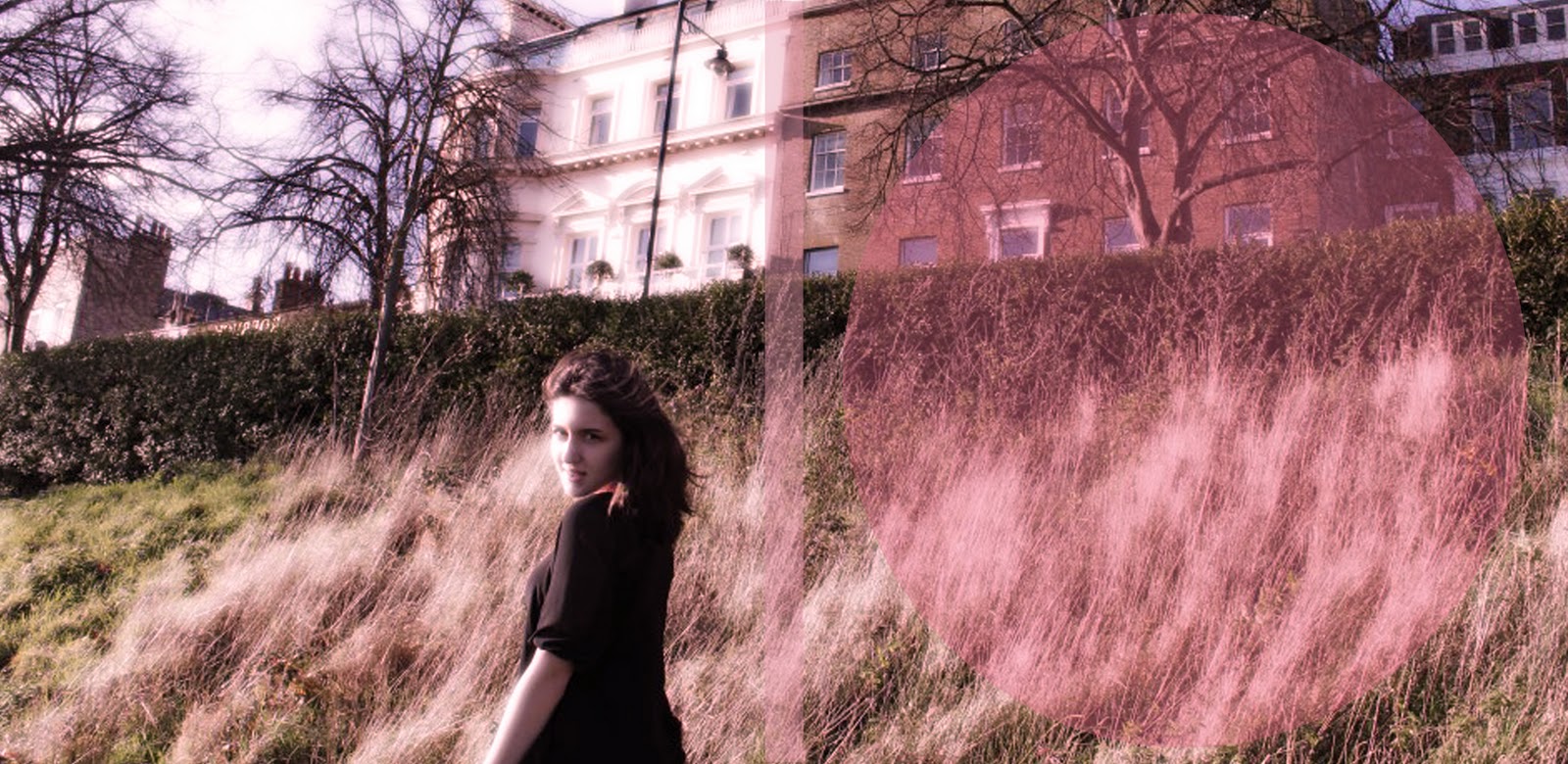
The second technique we used for our music video, was colour correction. When testing out colours we found a near-to-sepia type colour that looks great with the shots of the artist on the hill in Richmond. The idea is to use that in various other shots, but without ruining the nice sunlight we have in some of the shots.
 |
| Screen shots of how we used colour correction to add a pink tint. |
video to my ancillary products.

The forth technique i used whilst creating my ancilliary product I have used the diffused glow filter to create a nice glow effect on my products.

OH I ALMOST FORGOT! Here is our Animatic! A cute little imitation of how our music video was imagined to be like :)
First we took pictures on a Digital camera, we then imported the pictures to Final cut pro, to make our quick Animatic. Really pleased with this infact! :D
This was also a little practice of how to use Final Cut Pro.
This was also a little practice of how to use Final Cut Pro.
EVALUATION: QUESTION 2 - How effective is the combination of your main product (video) and ancillary texts (digipak and advertisement)?
In order for a music video to be successful it needs to create clear visual links between it and its ancillary products. For this reason I have created ancillary products that do exactly this, as I believe our music video was a success. I always knew that I wanted my Digipak and Advert to reflect the music video.
Throughout this whole journey Ellie Goulding and Rihanna have been our main inspirations. We implemented Rihannas 'Colour tint' from only girl in the world into our music video.

Rihanna also uses the 'Colour tint' for her Digipak. Therefore I would say my Digipak is really similar to hers. In addition Rihanna uses a close up for her Album cover, I too have done the same in order to create intimacy between the audience and artist and enable them to recognise her.
 |
| This is Rihannas Digipak, If you notice the front of the album is a close up which creates intimacy with the target audience. Secondly within the inside panels Rihanna is lying on a bed of Roses. |

Firstly we notice from both of the Ancillary products the colour red is quite vivid, this reflects her personality also makes it look visually pleasing.
It is evident there is a link between the Digipak and Advert, she has the same hairstyle in both, hair is still red and she is not directly looking at the audience. Just by looking at it the two clearly visually link together.
Now below I have screen shots from Rihannas music video 'Only girl in the world'.

It is clear from this screen shot that this links to the advertisement as the
loaction looks the same, the grass is the same. Also she has the same red hair in the same hairstyle.
 Also I can make the same comments about the hairstyle in this screen shot this directly links to the digipak and advertisement. Secondly, the flowers also link back to the inside panels of the digipak where Rihanna is laying.

Also in this screen shot the flowers and the red colour tint immediately relate back to the Digipak.
I believe that this is a really really successful music video. And I personally love the way it all links together which is why this inspired me to do the same for mine.


We took our digipak photos in the same location we
filmed; in Richmond park.
 We made sure our artist did not look drastically different in the digipak than in the video, so we ensured that she still had natural make with the same hairstyles and style of clothing.
From the inside panels, compared to these screen shots (made into a GIF) it is evident that both the filming and photo has been talking in the same 'grassy' place in Richmond.
Overall, all these similar features such as;
- Keeping the pink colour tint throughout music video and ancillary products.
- Same hairstyle and natural make up (so audience can identify the artist)
- Filming and photography in the same location for all three of our media products.
All these features creates a clear visual link between our music video and my ancillary products.
Also, As I kept to the conventions such as the three colour rule, right sized images ect means that the ancillary products will be more effective.
Friday, 20 January 2012
EVALUATION: QUESTION 1 - In what ways does your media product use, develop or challenge forms and conventions of real media products?
Friday, 13 January 2012


Advertisement Editing

This is the final photograph I have chosen for my Advertisement.

One of the fonts which I found effective is the one pictured above and the two other fonts I have used in my Digipak. I think it is really eye catching, especially in yellow.


Other than changing the colour in photo filter I have learnt how to get rid of the background of a Photo by using the magic tool. You simply click the section you want to disappear and then you press delete. Like I did with that star photo.

I also used photo filter in my Advertisement to follow through the pink tint effect. However I made it less obvious than my Digipak. Also I have added the appropriate texts which promote the Artist, such as the Artists name, Album name, Where the song is available, if you can find them on-line, ratings and her website.
Last minute change..
Before..
Where the pink colour was not employed and I had chosen different photos.


 AFTER..


Third day of editing

Okay so this was meant to be my finished Front panel. And the screen grab below is my unfinished Inside panel. I'm genuinely not pleased with my work as I feel it is rushed and have not employed the features I wanted to, due to not knowing how to use PHOTOSHOP!

Anyway, as I carry on finishing my Digipak. I realised how to add the features I would like and what photos would suit the front, back and inside panels more than my original choice.
 While I was looking through my photos once again, I found the PERFECT photo, not only is the artist looking at the camera, the photo is big enough to cover two panels! Yaay :)
 As my thoughts developed, I created this..

I enlarged the photo to fit two panels and then I added the necessary texts to the places where I decided looked best. I used the font A little pot regular as my main font, as I thought it would suit the genre of our artist.


To give my Digipak that hint of pink, I selected Photo filter and changed the colour to pink while increasing the density for my preferred shade of pink.
 |
| My new and improved Digipak Front and Back cover :D Which I am delighted with. |


Now, moving on to my Inside panels. I'm a bit confused as to which photos would suit this?1
However after a long think I have chosen to chose one photo that will be enlarged over two panels.


Wednesday, 11 January 2012
Second day of Editing

On the second day of editing I had realised that, as my Artist is a new upcoming artist, I would need a frontal view of her face looking directly at the audience wherein they can identify and recognise her. I then decided to use the photo above, however I face a problem whilst doing this, the picture appeared to be a tiny bit more pixelated than the others. Therefore this lead to the decision, in sticking with the original photo.

After deciding what photos would be suitable and would look the best for my Digipak. I then start adding the required text such as Artist name, Album name, song list, copyright information, record company website ect.

I took a screenshot of the Album cover to see how it would look, however I'm not satisfied with it..

So this is my near to be finished Digipak, however I have just realised it is not how I envisioned it and also it does not have a pink theme to it like I planned. This was my way of linking it to the music video.
Think I have a LOT of work coming my way..
Subscribe to:
Comments (Atom)