In order for a music video to be successful it needs to create clear visual links between it and its ancillary products. For this reason I have created ancillary products that do exactly this, as I believe our music video was a success. I always knew that I wanted my Digipak and Advert to reflect the music video.
Throughout this whole journey Ellie Goulding and Rihanna have been our main inspirations. We implemented Rihannas 'Colour tint' from only girl in the world into our music video.
Rihanna also uses the 'Colour tint' for her Digipak. Therefore I would say my Digipak is really similar to hers. In addition Rihanna uses a close up for her Album cover, I too have done the same in order to create intimacy between the audience and artist and enable them to recognise her.
 |
| This is Rihannas Digipak, If you notice the front of the album is a close up which creates intimacy with the target audience. Secondly within the inside panels Rihanna is lying on a bed of Roses. |
Firstly we notice from both of the Ancillary products the colour red is quite vivid, this reflects her personality also makes it look visually pleasing.
It is evident there is a link between the Digipak and Advert, she has the same hairstyle in both, hair is still red and she is not directly looking at the audience. Just by looking at it the two clearly visually link together.
Now below I have screen shots from Rihannas music video 'Only girl in the world'.

It is clear from this screen shot that this links to the advertisement as the
loaction looks the same, the grass is the same. Also she has the same red hair in the same hairstyle.
 Also I can make the same comments about the hairstyle in this screen shot this directly links to the digipak and advertisement. Secondly, the flowers also link back to the inside panels of the digipak where Rihanna is laying.
Also in this screen shot the flowers and the red colour tint immediately relate back to the Digipak.
I believe that this is a really really successful music video. And I personally love the way it all links together which is why this inspired me to do the same for mine.
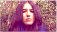
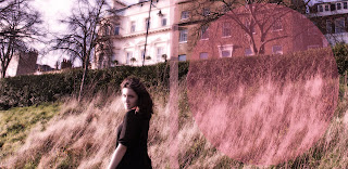
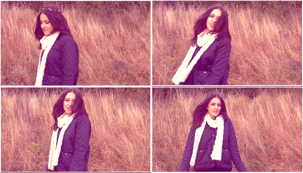
The first thing you can notice, is the colour effect. The pink colour tint runs throughout the screen shots of the video (made into a GIF) and into the ancillary products. As you can see the background of my advert is rural background same as some of the scenes from out music video shown in this GIF.
We took our digipak photos in the same location we
filmed; in Richmond park.
 We made sure our artist did not look drastically different in the digipak than in the video, so we ensured that she still had natural make with the same hairstyles and style of clothing.

From the inside panels, compared to these screen shots (made into a GIF) it is evident that both the filming and photo has been talking in the same 'grassy' place in Richmond.
Overall, all these similar features such as;
- Keeping the pink colour tint throughout music video and ancillary products.
- Same hairstyle and natural make up (so audience can identify the artist)
- Filming and photography in the same location for all three of our media products.
All these features creates a clear visual link between our music video and my ancillary products.
Also, As I kept to the conventions such as the three colour rule, right sized images ect means that the ancillary products will be more effective.


0 comments:
Post a Comment