After creating what i believe is a successful video, i wanted to create a digipak that reflected the video and an advert that reflected the digipak. we researched artists like Calvin Harris' 'Ready For The Weekend' who had a very clear link between his video and the single's cover.
There are clear links between the video and the single with the circles, primary colours and the brunette dancer. with the album the link is that there is another woman and her glasses, which are the key feature, but the glasses have CIRCLE bulbs on them.
Here Calvin Harris was going for and exact link as the video references the single cover. However i think that even though our video isn't as obvious, it is still very effective.



i wanted to maintain the same pink tint throughout all the media products. In the video Mia wears a lot of autumn/winter clothes like scarves and jumpers. So to keep the warm cosy theme i put here in a furry body warmer and quirky patterned shirt (like the patterned jumper that appears at the beginning of the video) which emphasises the autumn theme and also her original style. The audience can see the connection between the styles but most importantly of all the location, as both products were shot in the same location. We all fell so in love with Richmond that we thought there wouldnt be a better place to do it but there.

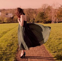 On the inside of the album i wanted to create a juxtaposition with the front, making it elegant. its a way to show the sophisticated side to Mia Knight. One of the main outfits in the videos was the shirt with the floaty skirt and i thought it would be a good idea to bring up the evening wear to the album as well. Our target audience of girls aged 16 to 24 can relate to her because this is the sort of evening-wear they would wear as it it is simple yet elegant.
 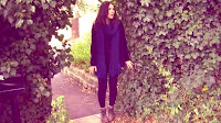 Behind the CD for the profile shot i used the same flowery head band that appears various times thought the video. I can see our target audience really relating to this as it is something they would wear at a festival with some wellies as they watch our artist on stage and it keeps in theme with the indie genre where things are natural and at one with nature.
 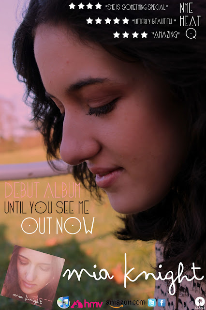 Again like the album and the video, the magazine advert has the same pink tint. In the image you can see that Mia is wearing the same shirt. As the photo is a close up you can see the make up she is wear is very natural and simple, the same kind of make up she wear in the video. She has a middle parting throughout everything so it would only be normal to continue that through to the advertisement as well to help construe her image and brand.


0 comments:
Post a Comment