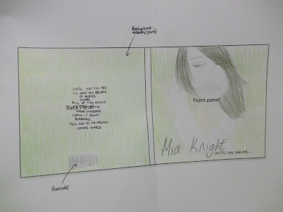
My first approach at doing a mock-up for my digipak was helpful as it gave me a clearer idea of what my digipak is going to look like. I accidently missed out a few VERY important things which my teacher (Louisa) pointed out; these were the copyright information, record label information and the spine.


0 comments:
Post a Comment